CSS Flexbox and Grid: Modern Layout Techniques Explained

Hey there, CSS explorer! 👋 Ready to level up your layout game? Today, we’re diving into two of CSS’s most powerful tools: Flexbox and Grid. No more fighting with floats or pulling your hair out over positioning – these modern layout systems make designing websites a breeze!
Key Takeaways
- Master Flexbox for one-dimensional layouts (rows or columns) ideal for navigation bars and card layouts Use CSS Grid for two-dimensional layouts perfect for page structures and galleries Understand when to use each:
- Flexbox: single direction, flexible sizing, navigation menus
- Grid: complex layouts, precise control, two-directional alignment
- Learn essential properties
- Flexbox:
display: flex,justify-content,align-items - Grid:
display: grid,grid-template-columns,gap
- Flexbox:
- Practice with real-world examples like responsive card layouts and navigation bars
Table of Contents
Why Flexbox and Grid?
Remember trying to center a div? Or creating a perfectly aligned navigation bar? What used to take dozens of lines of CSS (and plenty of headaches) can now be done in just a few lines. Let’s see how!
Flexbox: Your One-Dimensional Layout Friend
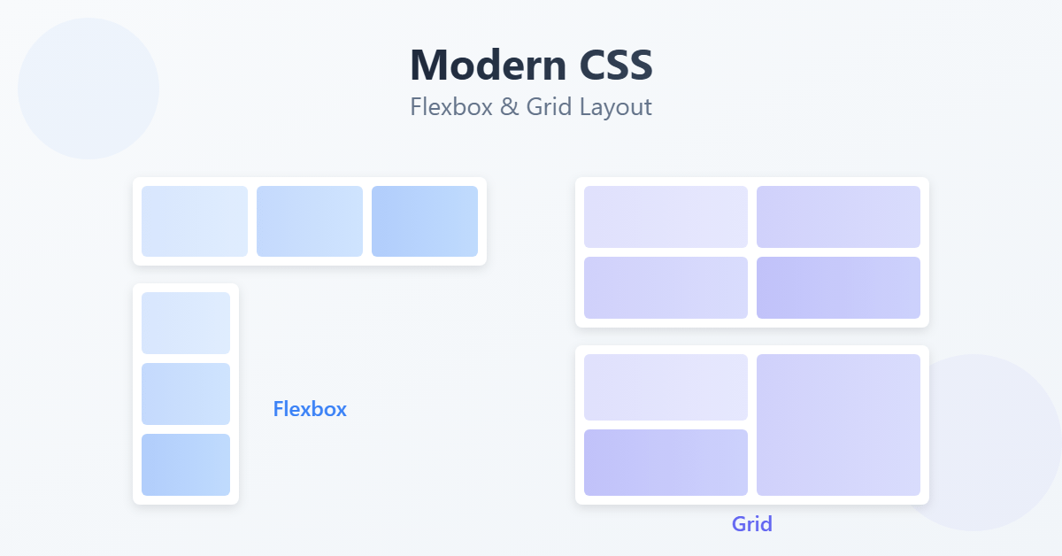
Think of Flexbox as a way to organize elements in a line – either horizontally or vertically. It’s perfect for:
- Navigation bars
- Card layouts
- Centering content
- Equal-height columns
Getting Started with Flexbox
First, you’ll need a container element (parent) with some items inside (children):
.flex-container {
    display: flex;
    justify-content: space-between;
    align-items: center;
    gap: 20px;
}
This simple code gives you:
- A horizontal layout (
display: flex) - Items spaced evenly (
justify-content: space-between) - Vertically centered items (
align-items: center) - 20px spacing between items (
gap: 20px)
Real-World Example: Navigation Bar
.navbar {
    display: flex;
    justify-content: space-between;
    align-items: center;
    padding: 1rem;
    background-color: #f8f9fa;
}

.nav-links {
    display: flex;
    gap: 1.5rem;
}
<nav class="navbar">
<div class="logo">Brand</div>
<div class="nav-links">
<a href="#">Home</a>
<a href="#">About</a>
<a href="#">Services</a>
<a href="#">Contact</a>
</div>
</nav>CSS Grid: Your Two-Dimensional Layout Superhero
While Flexbox works in one direction, Grid lets you work in both rows and columns simultaneously. It’s perfect for:
- Page layouts
- Photo galleries
- Complex dashboard designs
- Magazine-style layouts
Getting Started with Grid
Here’s a basic grid setup:
.grid-container {
    display: grid;
    grid-template-columns: repeat(3, 1fr);
    gap: 20px;
}
This creates:
- A grid layout (
display: grid) - Three equal-width columns (
grid-template-columns: repeat(3, 1fr)) - 20px spacing between items (
gap: 20px)
Real-World Example: Photo Gallery
.gallery {
    display: grid;
    grid-template-columns: repeat(auto-fit, minmax(250px, 1fr));
    gap: 1rem;
    padding: 1rem;
}

.gallery-item {
    border-radius: 8px;
    overflow: hidden;
}

.gallery-item img {
    width: 100%;
    height: 100%;
    object-fit: cover;
}
<div class="gallery">
<div class="gallery-item"><img src="photo1.jpg" alt="Gallery item"></div>
<div class="gallery-item"><img src="photo2.jpg" alt="Gallery item"></div>
<div class="gallery-item"><img src="photo3.jpg" alt="Gallery item"></div>
<!-- More items -->
</div>When to Use Which?
Here’s a simple guide:
Choose Flexbox when:
- You’re working with a single row or column
- You need flexible item sizes
- You want content-based sizing
- You’re building navigation or menus
Choose Grid when:
- You need both rows and columns
- You want precise control over item placement
- You’re creating a full page layout
- You need alignment in two directions
Cool Tricks and Tips
1. Center Anything with Flexbox
.perfectly-centered {
    display: flex;
    justify-content: center;
    align-items: center;
    min-height: 100vh; /* Full viewport height */
}
2. Responsive Grid Layout
.responsive-grid {
    display: grid;
    grid-template-columns: repeat(auto-fit, minmax(300px, 1fr));
    gap: 1rem;
}
3. Holy Grail Layout with Grid
.page-layout {
    display: grid;
    grid-template-areas:
        "header header header"
        "nav main aside"
        "footer footer footer";
    grid-template-columns: 200px 1fr 200px;
    grid-template-rows: auto 1fr auto;
    min-height: 100vh;
}

.header { grid-area: header; }
.nav { grid-area: nav; }
.main { grid-area: main; }
.aside { grid-area: aside; }
.footer { grid-area: footer; }
Practice Time!
Try creating this responsive card layout:
.card-container {
    display: grid;
    grid-template-columns: repeat(auto-fit, minmax(300px, 1fr));
    gap: 2rem;
    padding: 2rem;
}

.card {
    display: flex;
    flex-direction: column;
    padding: 1.5rem;
    border-radius: 8px;
    box-shadow: 0 2px 4px rgba(0,0,0,0.1);
    background: white;
}

.card-image {
    width: 100%;
    height: 200px;
    object-fit: cover;
    border-radius: 4px;
}

.card-content {
    flex: 1;
    display: flex;
    flex-direction: column;
    gap: 1rem;
    margin-top: 1rem;
}
Common Gotchas and Solutions
- Flexbox items overflowing: Add
flex-wrap: wrap;to your container - Grid items not spanning correctly: Check your
grid-template-areassyntax – all rows must have the same number of columns - Items not stretching in Flexbox: Use
align-items: stretch;(it’s the default) and make sure you haven’t set a specific height
What’s Next?
Now that you’ve mastered layouts, you’re ready to explore:
- CSS Animations and Transitions
- Advanced Grid Techniques
- CSS Custom Properties (Variables)
- Responsive Design with Media Queries
Keep experimenting with these layouts – the best way to learn is by building real things! Try recreating layouts from your favorite websites, and don’t forget to make them responsive.
Need help or got questions? Drop them in the comments below! Happy coding! ✨