Easy Guide to Creating Tables in HTML: Master Structure & Styling

Creating tables in HTML is an essential skill for web developers. Whether you’re displaying data, organizing information, or structuring content, I’ll guide you through everything from basic table creation to advanced techniques that will make your tables both functional and attractive.
Key Takeaways
- Master basic table structure with semantic elements – this forms the foundation for creating organized and accessible data tables.
- Implement accessibility features like captions, scope attributes, and proper headers to ensure your tables work for all users, including those with screen readers.
- Make your tables responsive using techniques like horizontal scrolling, stacked cards, or collapsible columns to ensure good mobile experience.
- Consider advanced features like sorting and filtering when needed, but always prioritize performance and proper data structure first.
- Follow best practices by using semantic markup, maintaining clean code, and testing across different devices to create tables that are both functional and user-friendly.
Table of Contents
Getting Started with Creating Tables in HTML
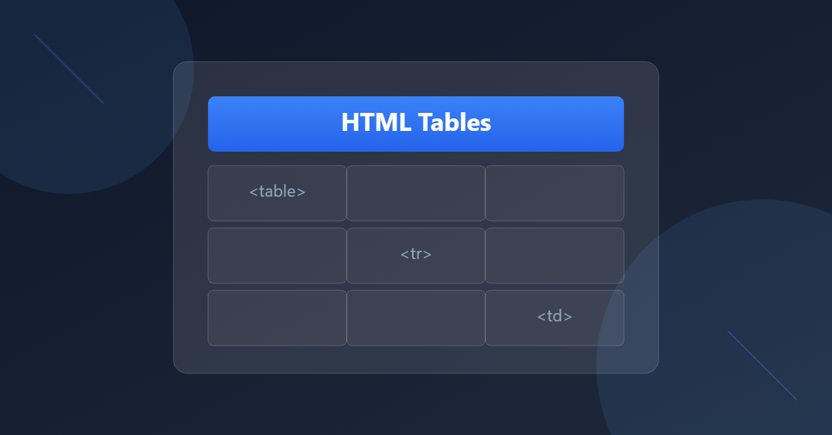
Let’s start with the fundamental building blocks of an HTML table:
<table>
    <thead>
        <tr>
            <th>Header 1</th>
            <th>Header 2</th>
        </tr>
    </thead>
    <tbody>
        <tr>
            <td>Data 1</td>
            <td>Data 2</td>
        </tr>
    </tbody>
    <tfoot>
        <tr>
            <td>Footer 1</td>
            <td>Footer 2</td>
        </tr>
    </tfoot>
</table>
Pro Tip: Always use <thead>, <tbody>, and <tfoot> – they’re not just for organization, they help with accessibility and make your tables easier to style!
Making Tables Accessible

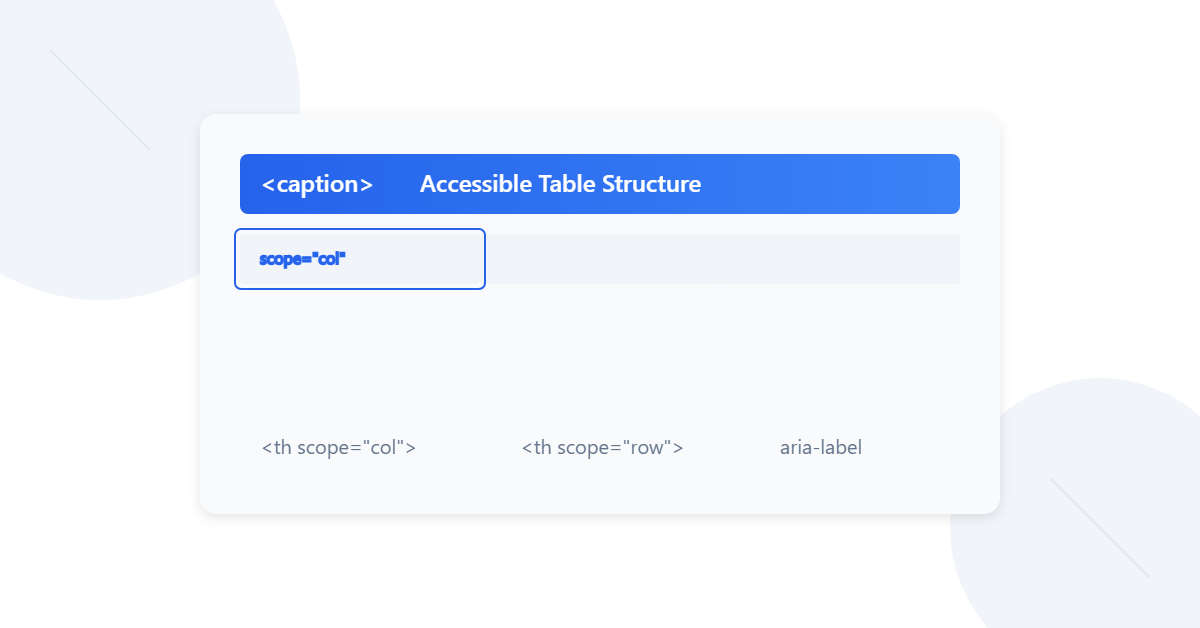
Accessibility isn’t optional – it’s essential! Here’s how to make your tables screen-reader friendly:
<table>
    <caption>Monthly Sales Report 2024</caption>
    <thead>
        <tr>
            <th scope="col">Month</th>
            <th scope="col">Revenue</th>
            <th scope="col">Expenses</th>
        </tr>
    </thead>
    <tbody>
        <tr>
            <th scope="row">January</th>
            <td>$10,000</td>
            <td>$8,000</td>
        </tr>
    </tbody>
</table>
Key accessibility features:
- Use
<caption>to describe your table - Add
scope="col"orscope="row"to header cells - Include proper header cells (
<th>) for both rows and columns when needed
Complex Table Structures
Now, let’s dive into some more advanced stuff! Here’s how to handle merged cells and complex data:
<table>
    <caption>Product Comparison Chart</caption>
    <thead>
        <tr>
            <th scope="col" rowspan="2">Feature</th>
            <th scope="col" colspan="3">Package Type</th>
        </tr>
        <tr>
            <th scope="col">Basic</th>
            <th scope="col">Pro</th>
            <th scope="col">Enterprise</th>
        </tr>
    </thead>
    <tbody>
        <tr>
            <th scope="row">Storage</th>
            <td>10GB</td>
            <td>100GB</td>
            <td>Unlimited</td>
        </tr>
        <tr>
            <th scope="row">Support</th>
            <td>Email</td>
            <td colspan="2">24/7 Phone & Email</td>
        </tr>
    </tbody>
</table>
Responsive Tables

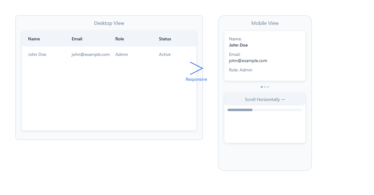
Making tables work on mobile devices can be tricky. Here are three approaches:
1. Horizontal Scrolling
<div class="table-wrapper">
    <table>
        <!-- Your table content -->
    </table>
</div>

<style>
.table-wrapper {
    overflow-x: auto;
    max-width: 100%;
}
</style>
2. Stacked Cards on Mobile
<table class="responsive-table">
    <thead>
        <tr>
            <th>Product</th>
            <th>Price</th>
            <th>Stock</th>
        </tr>
    </thead>
    <tbody>
        <tr>
            <td data-label="Product">Laptop</td>
            <td data-label="Price">$999</td>
            <td data-label="Stock">15</td>
        </tr>
    </tbody>
</table>

<style>
@media screen and (max-width: 600px) {
    .responsive-table thead {
        display: none;
    }

    .responsive-table td {
        display: block;
    }

    .responsive-table td::before {
        content: attr(data-label);
        font-weight: bold;
    }
}
</style>
3. Collapsible Columns
<table class="priority-table">
    <thead>
        <tr>
            <th class="priority-1">Product</th>
            <th class="priority-2">Category</th>
            <th class="priority-3">Price</th>
            <th class="priority-4">Stock</th>
            <th class="priority-5">SKU</th>
        </tr>
    </thead>
    <tbody>
        <tr>
            <td class="priority-1">Gaming Mouse</td>
            <td class="priority-2">Electronics</td>
            <td class="priority-3">$59.99</td>
            <td class="priority-4">45</td>
            <td class="priority-5">GM-001</td>
        </tr>
    </tbody>
</table>

<style>
@media screen and (max-width: 800px) {
    .priority-5 { display: none; }
}
@media screen and (max-width: 600px) {
    .priority-4 { display: none; }
}
@media screen and (max-width: 400px) {
    .priority-3 { display: none; }
}
</style>
Advanced Features: Sortable Tables

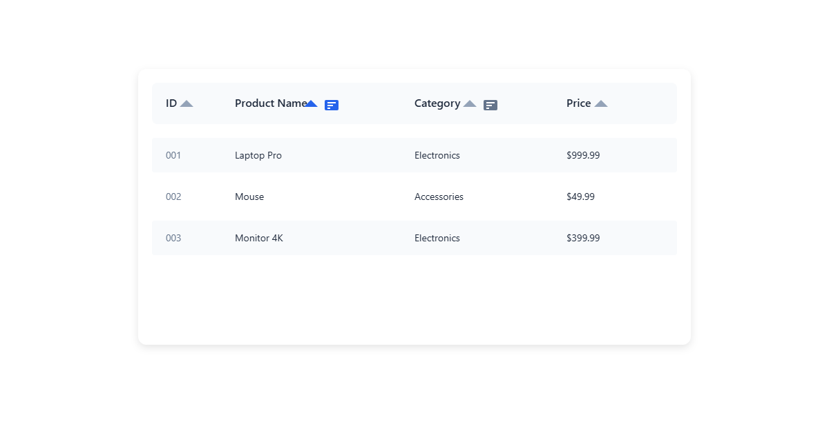
Here’s a basic example of how to make a sortable table:
<table id="sortable-table">
    <thead>
        <tr>
            <th data-sort="string">Name</th>
            <th data-sort="number">Age</th>
            <th data-sort="date">Join Date</th>
        </tr>
    </thead>
    <tbody>
        <tr>
            <td>Alice</td>
            <td>28</td>
            <td>2024-01-15</td>
        </tr>
        <!-- More rows -->
    </tbody>
</table>

<script>
document.querySelectorAll('#sortable-table th').forEach(header => {
    header.addEventListener('click', () => {
        const type = header.dataset.sort;
        const index = Array.from(header.parentNode.children).indexOf(header);
        sortTable(index, type);
    });
});

function sortTable(column, type) {
    // Sorting logic here
}
</script>
Best Practices Summary
- Structure
- Always use semantic table tags (
<thead>,<tbody>,<tfoot>) - Include proper headers with
<th>elements - Use
<caption>for table descriptions
- Always use semantic table tags (
- Accessibility
- Add proper scope attributes to header cells
- Use aria-label for complex tables
- Maintain a logical reading order
- Responsiveness
- Choose the right responsive strategy based on your data
- Consider progressive enhancement
- Test on various screen sizes
- Performance
- Lazy load large tables
- Consider pagination for big datasets
- Use appropriate data types for sorting
If you’re looking for a simple way to understand the concept better, give this easy-to-use HTML table generator tool a try. It’s a quick and practical way to get hands-on experience!
Real-World Example: Dashboard Table
Here’s a complete example bringing everything together:
<div class="table-container">
    <table class="dashboard-table">
        <caption>Sales Performance Dashboard</caption>

        <!-- Table Header -->
        <thead>
            <tr>
                <th scope="col" class="priority-1">Product</th>
                <th scope="col" class="priority-2">Category</th>
                <th scope="col" class="priority-1">Sales</th>
                <th scope="col" class="priority-3">Growth</th>
                <th scope="col" class="priority-2">Status</th>
            </tr>
        </thead>

        <!-- Table Body -->
        <tbody>
            <tr>
                <th scope="row" class="priority-1">Laptop Pro</th>
                <td class="priority-2">Electronics</td>
                <td class="priority-1">$45,000</td>
                <td class="priority-3">
                    <span class="badge positive">+15%</span>
                </td>
                <td class="priority-2">
                    <span class="status active">Active</span>
                </td>
            </tr>
            <!-- More rows... -->
        </tbody>

        <!-- Table Footer -->
        <tfoot>
            <tr>
                <th scope="row" colspan="2">Totals</th>
                <td>$245,000</td>
                <td colspan="2">+12% Average</td>
            </tr>
        </tfoot>
    </table>
</div>

<style>
.dashboard-table {
    width: 100%;
    border-collapse: collapse;
    margin: 1rem 0;
}

.dashboard-table th,
.dashboard-table td {
    padding: 0.75rem;
    border-bottom: 1px solid #e2e8f0;
}

.badge {
    padding: 0.25rem 0.5rem;
    border-radius: 9999px;
    font-size: 0.875rem;
}

.badge.positive {
    background-color: #def7ec;
    color: #03543f;
}

.status {
    display: inline-block;
    padding: 0.25rem 0.5rem;
    border-radius: 9999px;
    font-size: 0.875rem;
}

.status.active {
    background-color: #ebf5ff;
    color: #1e40af;
}

/* Responsive Design */
@media screen and (max-width: 768px) {
    .priority-3 {
        display: none;
    }
}

@media screen and (max-width: 480px) {
    .priority-2 {
        display: none;
    }
}
</style>
Explore the modern layout techniques with this handy guide on CSS Flexbox and Grid. It’s a great way to level up your design skills!
Wrapping Up
Tables might seem simple at first, but as you can see, there’s a lot you can do with them! The key is to start with a solid, semantic structure and then enhance it based on your specific needs. Remember that accessibility should never be an afterthought – it should be built in from the start.
Keep experimenting with these techniques, and don’t be afraid to combine different approaches to create the perfect table for your project. Just remember: tables are for tabular data, not layout!
Happy coding! 📊✨
P.S. Want to take your tables to the next level? Try adding features like client-side sorting, filtering, or even data visualization with charts!